Adobe’s new Color Mode in Premiere Pro Beta is not a panel, not a feature, not an update. It is a philosophical act. It is a declaration that the art of color grading has been withheld from its rightful owners for too long.

There is a moment in Jason Druss’s live demo, Principal Product Marketing Manager for Premiere and After Effects, a brief and almost offhand remark that quietly contains everything you need to understand about Color Mode. He says,
“It took me about five years to learn how to do this from scratch. And now every editor in the world can accomplish creative tasks like this by simply moving their mouse up, down, left, or right.”
He says it without fanfare. He moves on. But that sentence should stop every post-production professional in their tracks, because it captures a generation of squandered creative energy and the audacity to end it.
For more than a decade, the color pipeline has been the defining fault line in editorial work. On one side are the Non-Linear Editors (NLE’s) built-in tools, functional enough for a quick grade but with a low ceiling that everyone in the room can see. On the other side are dedicated grading systems, extraordinary instruments built for experts who have invested years, sometimes entire careers, learning the craft. In between those two poles, an entire generation of editors found themselves stranded. They could feel the image they wanted. They could not reach it.
Adobe’s response to that stranded generation is Color Mode in Premiere Pro Beta, announced at this week’s NAB press conference and available to all Premiere users from April 15th. It is, by any honest reckoning, the most ambitious thing Premiere has attempted in years.

The Interface as Argument
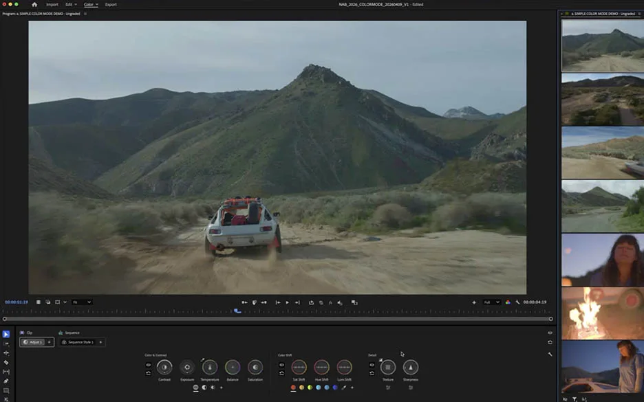
The Color Mode workspace lands with genuine visual impact. The program viewer is enormous. Not just large, but assertively large. It signals an editorial philosophy. The image is primary. Everything else serves it.
To the right sits the vertical clip grid. This may be the most important element in the interface. Instead of a horizontal filmstrip, clips are stacked vertically. You see the entire sequence at once. No scrubbing. No searching. No loss of orientation.
At the bottom, all core controls are visible at all times. Contrast, Exposure, Temperature, Balance, Saturation, Sat Shift, Hue Shift, Lum Shift, Texture, and Sharpness. Nothing is hidden. Nothing is collapsed. The system shows everything and trusts the editor to decide.
Human Factors: What the Layout Gets Right
From a human factors perspective, this layout solves a long-standing problem. Traditional color tools require constant navigation. Wheels, curves, qualifiers, and nodes require the user to remember where everything lives while judging the image. That split attention creates cognitive load.
Color Mode removes most of that burden. When every control is visible, the eyes can remain on the image. The Heads-Up Display (HUD) system takes this further. When you interact with any control, a scope appears directly in context. It does not live in a separate panel that you must consciously check. It appears only when needed, then disappears.
This behavior feels almost conversational. The system responds only when it has something useful to say. The waveform that appears during a contrast adjustment is not just functional. It is instructional. It teaches the relationship between action and result in real time.
Styles, Modules, and the Grammar of Film
The most cinematically meaningful part of Color Mode is its Style and Module system. It is also the most likely to be misunderstood. As you browse the Style Presets, you see names like “Howard Hughes,” “2 Sun 2 Furious,” “California Sunkissed,” and “Jason’s Freaky Contrast,” each previewed live on the footage. It is easy to assume these are simply LUTs with a friendlier interface. That assumption is incorrect, and the distinction matters.
Styles are not Look-Up Tables (LUTs). LUTs are fixed, often destructive transformations that require experience to adjust properly. They apply a mathematical change to the image and leave little room for interpretation unless you understand the underlying system.
Styles are built differently. They are collections of pre-graded color effects called modules. Each module represents a specific idea. Each one is editable and visible. When you apply a style like California Sunkissed, you are applying a system. A film color module, a contrast kit, and perhaps a highlights treatment. You can open each part. You can adjust parameters such as Compression. You can remove modules and replace them. The style is not the final look. It is a starting point and a vocabulary.
The Film Color module extends this idea. It provides access to over 90 film emulations: Fuji Eterna 250, Fuji Eterna 500, Kodak 5201, Kodak 5212, Kodak 5218, Kodak 5299, Kodak SFX, and many more. Not as simulation overlays, but as the actual tonal characteristics of each stock integrated into the grade. For experienced colorists, these names carry meaning. For editors, they become an entry point. This is not a simplification of film color. It is an expansion of access.

Operations: A New Paradigm for Grade Structure
If Styles are the emotional vocabulary of Color Mode, Operations are its grammar. They may become the feature that professional editors find most transformative once the initial novelty fades. The idea of grouping clips is not new. Tools like DaVinci Resolve have long supported grouping and shared adjustments. What is different here is not the existence of groups, but the clarity of the system around them.