

The Silent Cost of Ignoring Edge Cases in UX Research

  • Home
  • The Silent Cost of Ignoring Edge Cases in UX Research
The Silent Cost of Ignoring Edge Cases in UX Research

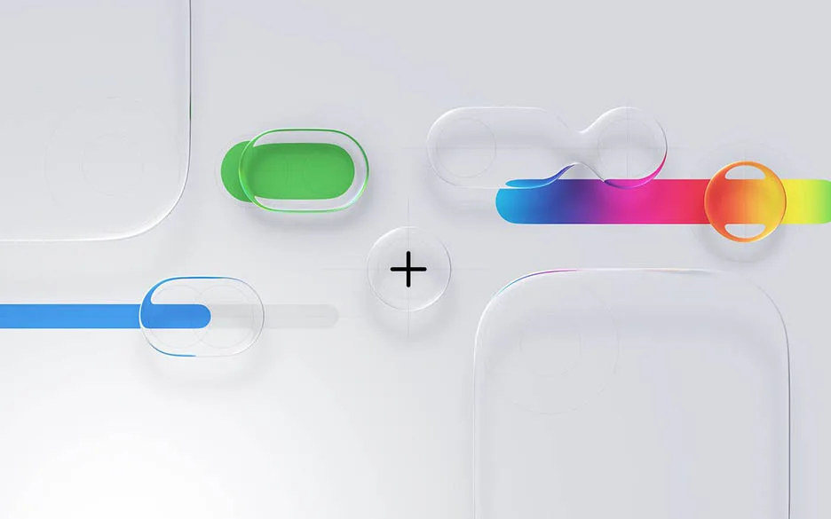
I just updated my iPad Pro to iOS 26 so I can experience Apple’s new Liquid Glass design. First impression: It looks great; menus and buttons feel alive, shifting with light and motion. But within minutes, I noticed something: legibility issues when my background wallpaper was busy. Beautiful design, yes, but also a reminder of how edge cases quietly shape the user experience.

Edge cases are not rare glitches. They are the real-world contexts that slip through the cracks when teams design for the “average user”:
• A translucent UI that becomes unreadable against personal photos.
• Accessibility challenges when contrast shifts in motion or low light.
• Older devices struggling with performance-heavy effects.
• Users outdoors battling glare and reflections.

Ignoring these cases may feel efficient in the short term, but the cost comes later in the form of frustrated users, quick workarounds, and design “fixes” that can be expensive.

Researching edge cases is not about slowing down. It is about building confidence that a design works not just in perfect conditions, but in the messy, varied contexts where people actually live.

Have you noticed any quirks with Liquid Glass so far, or seen other products where the “wow factor” came at the expense of usability?

Leave a comment